News of Ferragamo ‘s rebranding sparked several discussions regarding the strategic choice to simplify the logo.
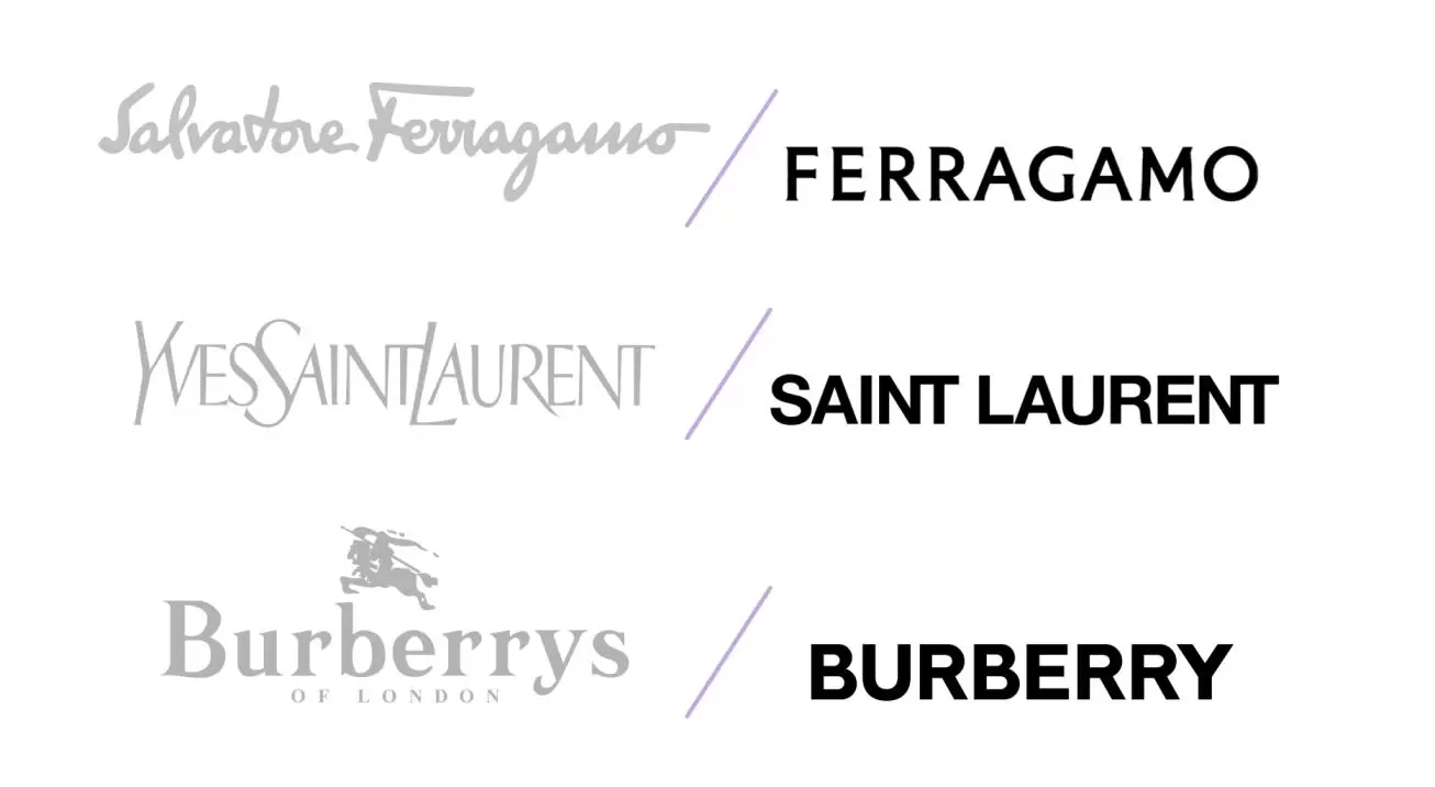
Following the solutions adopted by other haute couture brands-see Saint-Laurent, Balenciaga, Burberry-the Florentine brand has thus switched from the iconic signature, calligraphic font, to just the surname represented in a serif, bold font.
Juxtaposed next to the other logos, the stylistic uniformity and simplicity, the reason for the public’s disappointment, is evident.
Now, behind this choice lie two very obvious intentions.
The moment a brand becomes strong, recognizable and famous enough, it can afford to simplify its identity in order to make itself more easily recognizable and memorable. In fact, brands like Ferragamo operate in global markets, with pluralities of cultures accustomed to different visual images. Hence the need to make one’s image more neutral and universal.
Second, and no less important, there is the need to better develop one’s digital positioning: a simple and clear logo like the latter lends itself better to the different formats it must take depending on the devices in which it is displayed.
On the other hand, theidentity that permeates a logo cannot be overlooked. The famous designer’s signature was the highest expression of the company’s identity, making it distinctive and unique, and making its Italian origins and craftsmanship evident. Instead, to date, the new brand does not enhance but homogenizes with the masses, making it necessary to read the name to identify the brand.
Only time will tell if the choice is worth the candle.

