Project Description
NAMING AND PACKAGING: HOW TO CHOOSE THE RIGHT SUIT FOR YOUR PRODUCT
We present here the case study of “Ti Porto A Casa,” a line of ready-to-eat fish dishes from Pesca Pronta, to understand how to position yourself in the large-scale retail trade in an appealing way.
Landing in large-scale retail also means competing with a flood of similar brands.
The shelf is nothing more than a showcase for your (and a thousand other) products: the way they are presented can be the key factor in the consumer’s final choice.
As with a mosaic, a marketing strategy is only successful if each piece is carefully thought out and shows consistency as a whole.
Thus, as we at TMA often repeat, visual identity is not just the logo, but the totality of all the elements with which people interface. The naming is one of the fundamental elements of recognition, and packaging, far from being JUST the packaging and container, is a real means of communication.
Now we come to us.
Pesca Pronta, a brand with which we have been collaborating for years that deals with the import-export of seafood products, has shown interest in landing in the Large-scale retail channels, with a ready-made that combines the quality of fresh fish with traditional Italian recipes.
An innovative and unique product range on which a coherent, vibrant and appealing identity had to be created.
Choosing a naming is a complex creative process that requires numerous briefings with the client and strategic analysis, which must channel into one or more words that reflect the values of ease, memorability and originality.
For the product line in question, the choice settled on “Ti Porto A Casa” (I’ll take you Home) a playful name that immediately establishes a relationship with the person, clearly identifies the type of product (pret-a-porter) and solves a problem (lack of time to cook).
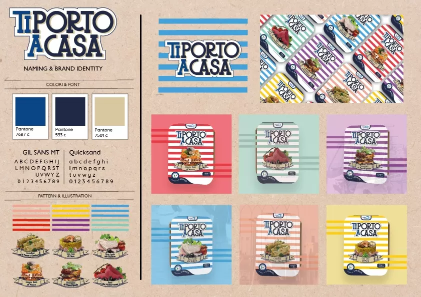
So, already the naming addresses the brand identity according to a precise personality and tone of voice, which must also present itself consistently in subsequent communicative outputs.
Since this is fresh fish, it was decided to construct packaging that recalls the maritime environment: a graceful font typical of harbor signs, bright colors ranging from the blue of the sea to the red and yellow of the sun, the horizontal bands that recall boardwalks in beaches.
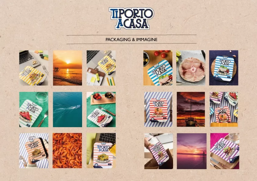
Each product-recipe is uniquely identified by a precise color and a representative image.
If the project has excited you and you would like to position your brand in the GDO, please do not hesitate to contact us, we will design together the best path to make your products memorable !
