Project Description
Creating the website is only one step in a broader digital marketing strategy.
SEO, content marketing, online adv campaigns, direct e-mail marketing, digital PR.
In many cases, companies when commissioning the creation of a website assume that this channel ‘almost magically’ can, by itself, increase the number of their customers. If not embedded within a strategy aimed at generating trust and authority, rather than converting and building loyalty it risks being a showcase with little appeal. In order to recognize a communicative coherence across touchpoints, it is therefore imperative to develop a solid, clear and adaptable brand image across channels.
THE PRELIMINARY ANALYSIS
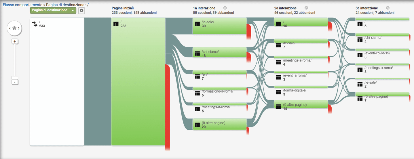
In this broad process, the first stage of scenario, competitor and target analysis plays a crucial role. Speaking of the audience, through what channels do they come to the site? Which pages do they visit the most? What is the dwell time on individual pages?
The metrics that can be considered are indeed many. By understanding who the users are, one will also understand what problems they are facing and offer them the most accurate and consistent solution.
Here we show what we made for Forma Spaces , a company that operates in the MICE (Meetings, Incentives, Conferences, Exhibitions) industry, offering rooms for training, meetings and events. A sector that follows the flows of the education sector and finds July-August to be the period of greatest demand. Having ascertained this, the initial request included the implementation of digital and direct marketing campaigns with two clear objectives: increased brand recognition and theacquisition of new customers.
Although the brand already possessed a proprietary site, this was shown to be impractical in converting customers. With the budgeted budget, we then opted to create a landing page designed specifically to take users down the funnel path.
The study of user performance led us to revise the positioning of text and image blocks so as to recreate a new User Experience (UX) that would go to the most salient information immediately.
In fact, two main problems were:
- too high a bounce rate and exit rate on the Home Page, a sign of too much confusion, visual and information;
- Although the most visited page was about the halls, there was no direct link in the sites where Forma Spaces was placed.
THE LANDING PAGE
Thus, bringing to life a layout that divided between training, conferences, events, and meetings, we displayed photos of the rooms with related descriptive copy and call-to-action, so that the user would immediately know which option was the most congenial.


The next phase involved ranking on the Google search engine through SEO and SEM. In fact, the previous site was not optimized and users only landed via links from external pages.
Through Google Ads, we then carried out a search effort for the most frequently used queries in the search for meeting, convention and trade show rooms. Here, too, we created a funnel: in the first phase, a large pool of possible keywords was created, which brought in numerous views but a fluctuating number of conversions, subsequently excluding those less on target. We thus arrived at a total of 10 search queries optimized for our site.
Based on the best performance, three Google adv campaigns were subsequently developed, with two different ads, three budgets and interlocking time slots, to maximize conversions.
The results?
- Forma Spaces ranked among the top 4 Rome companies in the market;
- Has the highest ranking for impression shares;
- for every euro invested, there was a return of 5.5 euros (including our fee);
- ROI of 412% as of May 2022.
Given the outcomes, after a year and a half of collaboration it was time for Forma Spaces to make a redesign of the site. Rethinking this channel does not mean reworking the look according to trends, but translating the corporate identity, which obviously changes and renews over the years, into current visual elements. Graphics, structure and functionality are the most interspersed elements in developing a smooth and inspiring User Experience.
It is the brand identity that gives unity and cohesion to all the elements, thus allowing easier connection with the target audience and ensuring greater recognition. As you can well understand, it is only one step of a broader strategy, which incorporates SEO actions, content marketing, online adv campaigns, direct e-mail marketing, digital PR.
Only then is the site able to attract quality audiences, increase conversions, and build customer loyalty.
THE WEBSITE.
We now show you the final result of the redesign of the Forma Spaces website.

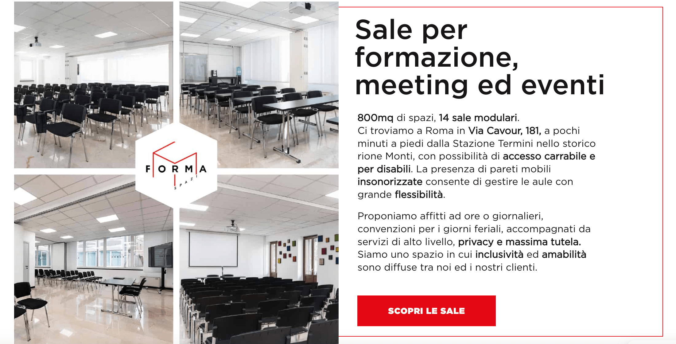


An eye-catching layout due to the development of the brand identity on digital, with the use of red as the key color and geometric shapes that make up the structure and recall the logo cube. The hierarchy of information is very clear: ample space for the division of rooms, the user is able to move easily between the various pages of the site, and finally arrive at the action, the call or filling out the form.
The same campaigns found better performance from the moment they landed on the new website. Views increased considerably, 57% of which were new users, and there was also an increase in the retention rate, with +37% of users returning to revisit the site. The data also suggest to us how the User Experience has improved significantly: the viewing flow is now smoother, with less time spent on the Home Page and more views of the ‘Sale’ page, the one suitable for displaying offers and thus converting.
In conclusion, this case study is a clear example of how, in order to arrive at a performing website, it is necessary to structure a strategy that is much broader than just visual restyling. Branding, advertising, and digital marketing are building blocks that need to be skillfully linked together to form a functional, high-performing structure.
Is your website performing well?
Contact us to discover our solutions !
