Project Description
BRAND IDENTITY MEANS MAKING A LOGO?
There is often a tendency in the world of communication and marketing to reduce and trivialize brand identity. The graphic sign is certainly a central element in the construction of a visual identity, but it is only the tip of an iceberg, a manifestation of an entire value universe that must be constructed a priori.
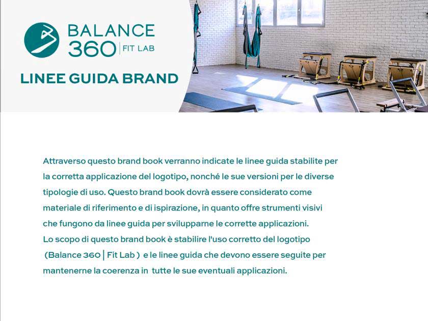
So here we present the brand identity project that involved Balance 360, innovative Fit Lab which, through the practice of
Pilates
,
Yoga
e
Functional
, aims to propose a high level of well-being through the intelligent movement. Our client for that matter already possessed a logo, but needed to build a complete identity in order to communicate effectively.
![]()
For this client, we first had to develop the Brand Bible.
For those unfamiliar with the field, this term stands for the value and graphic ecosystem that gives shape and substance to a brand’s communicative identity. Included in this manual are all the necessary guidelines to be used whenever the company needs to communicate to people: uses, declinations e applications such as to show a consistent visual.
In order to develop this, symbiotic collaboration with the partner is necessary, so as to thoroughly glean the following history, identity, vision e goals, to turn them into consistent and suitable graphic assets.
It is among the flagship outputs that we at
The Modern Age
know how to produce, and we want to show you some excerpts from this case history.
The first part of the paper summarizes and reinterprets all theanalysis breakthrough on the brand, going to outline the attributes, personality, mission and vision. The analysis phase is critical to optimal implementation; it must be carried out meticulously and often the most time is devoted to it.
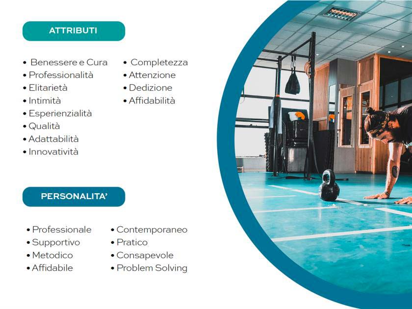
The concept of holistic all-round wellness was central to the course, developing communication around the concept of “intelligent movement” and interdisciplinary psychophysical renewal.
Next comes the definition of the logo, then fonts, colors and different declinations. All formats and types of use should be considered, so as to cover all possible applications. Website, social, but also business cards, banner ads, showrooms. Different uses, different needs, same visual concept.
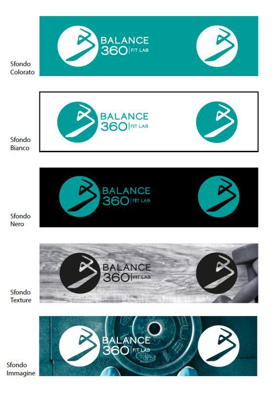
The graphic elements do not follow a simple aesthetic taste, but become the full expression of the brand. For Balance 360, Octanium Green, an expression of dynamism, energy and vitality, was chosen as the main color. Midway between blue and green, octanium has the beautiful coloring of dark turquoise with the properties that its constituent colors imply: soothing for blue, energizing for green.
Thus, the Brand Bible is a key asset for any company. It does not produce increased sales per se, but it is backbone structure of the whole communication. So, how this is perceived by the public.
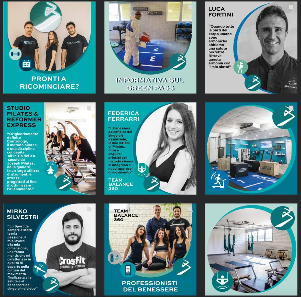
We structured social communication for Balance 360, building an editorial plan that included informative and engaging content that was useful to the public and tempo itself that would give authority and prestige to Fit Lab. All this following structured and efficient communication.